A signature of security, vigilance, and connectivity
Client
GardaLocation
Montreal, QC, CanadaYear
2023-
Discipline(s)
Branding and Graphic Design
A signature of security, vigilance, and connectivity
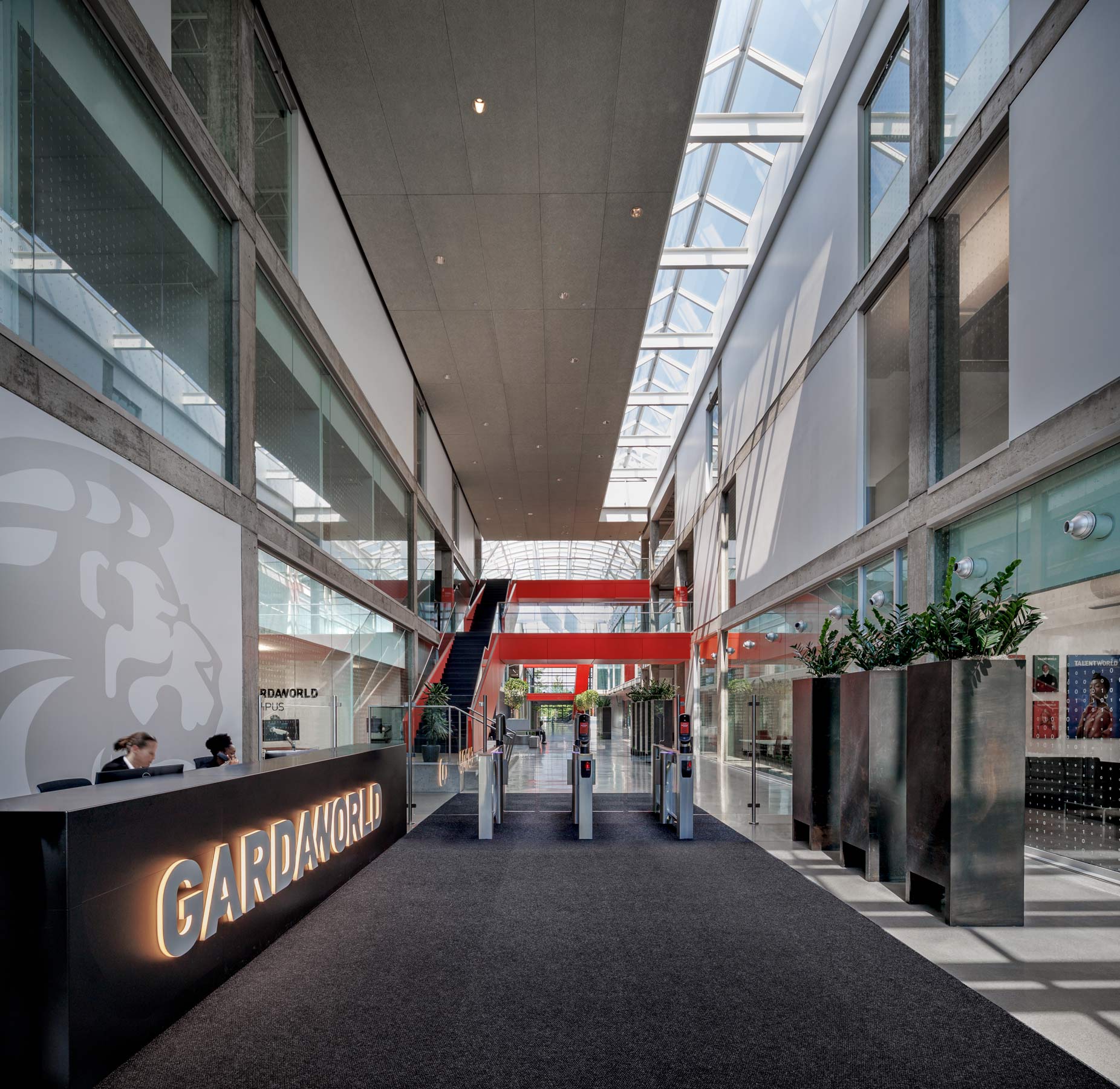
GardaWorld’s new head office, situated in Montreal’s Saint-Laurent borough, reflects the strength and high precision of the company’s security and management services. With an integrated brand strategy and striking signage system, the space comes alive, immersing visitors in GardaWorld’s mission and values.
Our team of branding and wayfinding experts collaborated closely with the client to craft a visual language that encapsulates GardaWorld’s essence. The result is a seamless fusion of the logo, a sleek colour palette comprising black, white, red, and gray, and impactful taglines and mission statements that adorn corridors and windows. The proud logo placement at the entrance’s floor in a Pentagon-inspired manner sets the tone as soon as users walk in, affirming the client’s mission statements of power and security. In the fitness and dojo rooms, GardaWorld’s emblematic lion takes a central spot as a reminder for unity and strength. The sobriety of a black box inspires the finishes for meeting rooms.
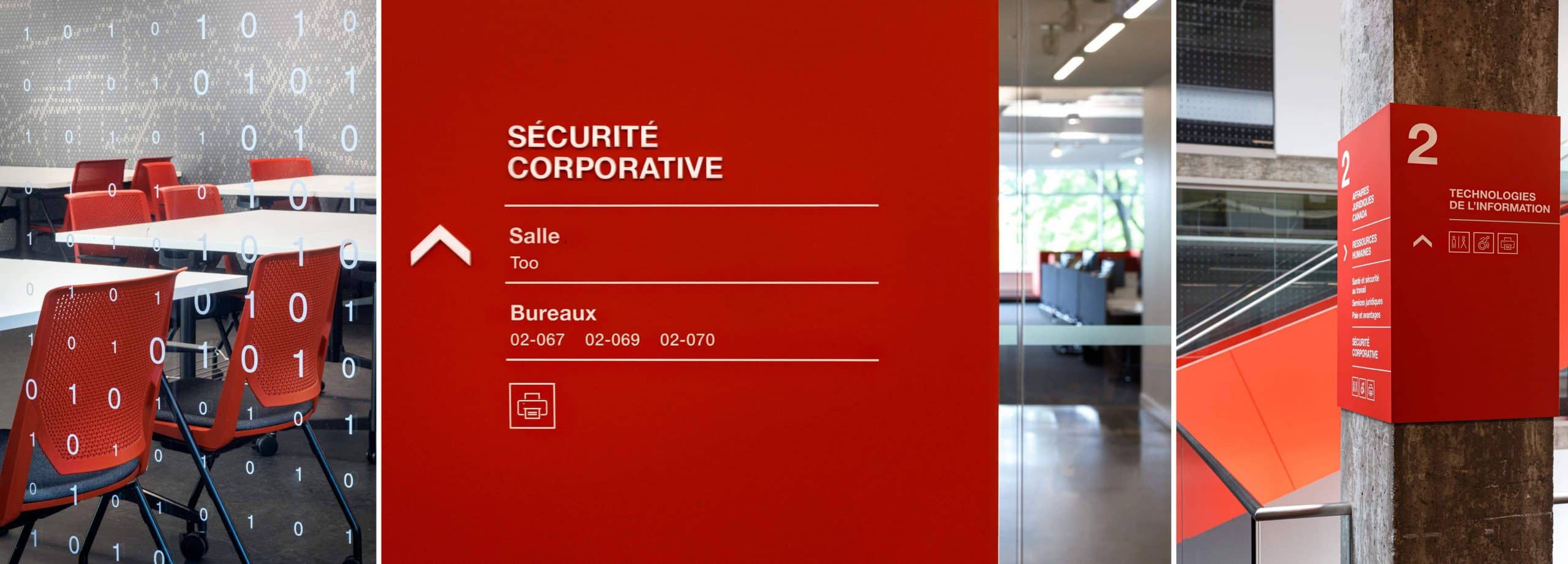
Inside the headquarters, every detail speaks volumes. Custom pictograms, serving as an easily recognizable signage system, guide users through various areas. These bespoke symbols not only facilitate navigation but also further reinforce GardaWorld’s brand identity. Red and black lines elegantly link spaces from one department to another. This is noteworthy in the building’s entrance, where bold red staircases divide the central atrium, acting as both a striking visual element and a clear means of orientation.
By skillfully integrating design elements, colors, and messaging, GardaWorld’s new headquarters embodies the essence of the company. It is a testament to their commitment to power, security, and unity—a space where the brand truly comes alive, leaving a lasting impact on everyone that enters.