A distinct identity for a city’s cycling culture
Client
City of MontrealLocation
Montreal, QC, CanadaYear
2020-
Discipline(s)
Branding and Graphic Design
A distinct identity for a city’s cycling culture
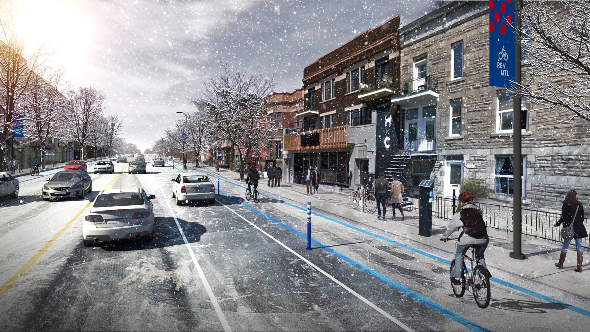
Expressing a city’s love for cycling and its sustainable contribution to multimodal transportation, the branding for the Réseau express vélo (REV) was designed to reflect its four-season network’s thoughtful utility and joyful leisure found all across its 184 kilometres of interconnected cycling paths.
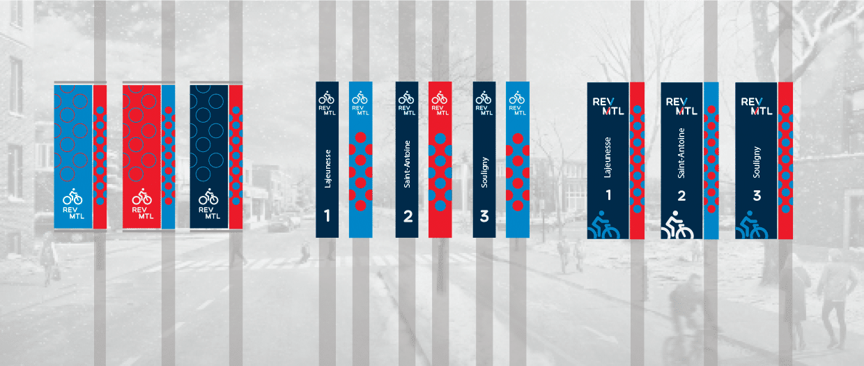
Working with urban planners and landscape architects, Lemay’s branding and graphic design teams composed a visual identity for the REV that could complement both its phased rollout and further expansions, support the safety of its users with distinctive wayfinding and organization, and capture the pure pleasure and convivial community surrounding cycling in an urban setting.
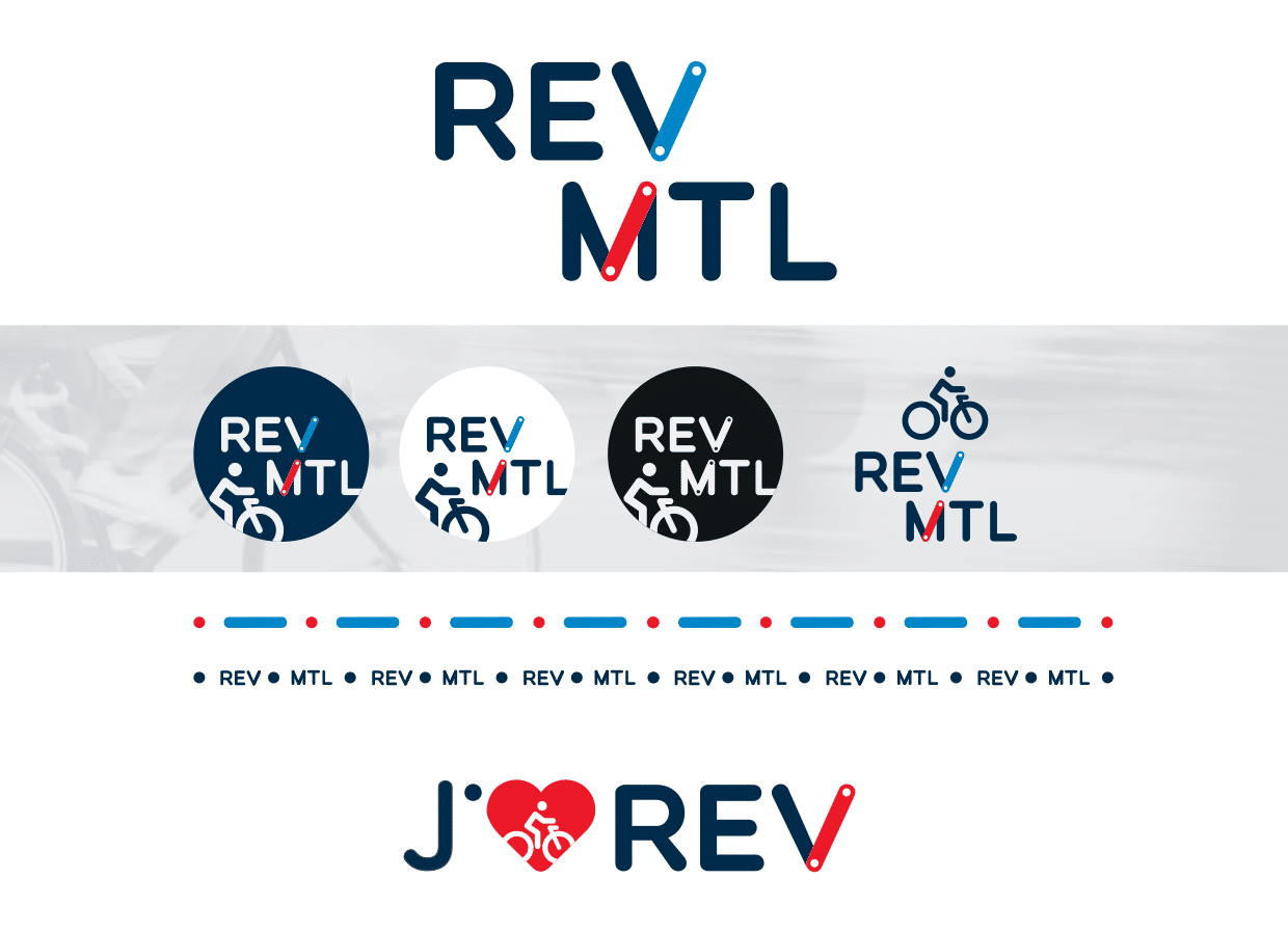
Inspired in part by the city’s own metro system’s coloured lines for routes and dots to indicate stops and waypoints, the REV’s logo aligns the oblique letters ‘V’ in REV and ‘M’ in MTL, connecting the concepts of a city and its network while evoking routes taken and destinations arrived at. The dots, reminiscent of bicycle wheels and movement, is easily adaptable for ground markings, on urban furniture and in communications as well. When used with the bicycle symbol, the shape recalls the diamond road signage of reserved lanes. The branding colour scheme is one of place, freedom, and peace of mind: Red to speak to the City of Montreal’s logo, the city’s place as a leader in public transportation, and a dynamic touch to encourage action; light blue to suggest space, air, and travel; and a darker blue to evoke security.
With a character distinct from its inspiration, the REV’s branding creates a sense of pride and belonging with a concrete and versatile brand, further anchoring Montreal’s bicycle culture into the planning of the city with a structuring, comfortable and safe presence.


