Capturing a sense of purpose, strength and collective identity through space and raw materiality
Client
GardaWorldLocation
Montreal, QC, CanadaYear
2023-
Discipline(s)
Branding and Graphic Design
Capturing a sense of purpose, strength and collective identity through space and raw materiality
The interior design of GardaWorld’s headquarters in Montreal’s Saint-Laurent borough is a seamless integration of features that reflect the private security firm’s mission and values in a modern and versatile workplace. Guided by three core concepts—Objects, Bond, and Brand—the project aligns with GardaWorld’s purpose and services through carefully curated details.
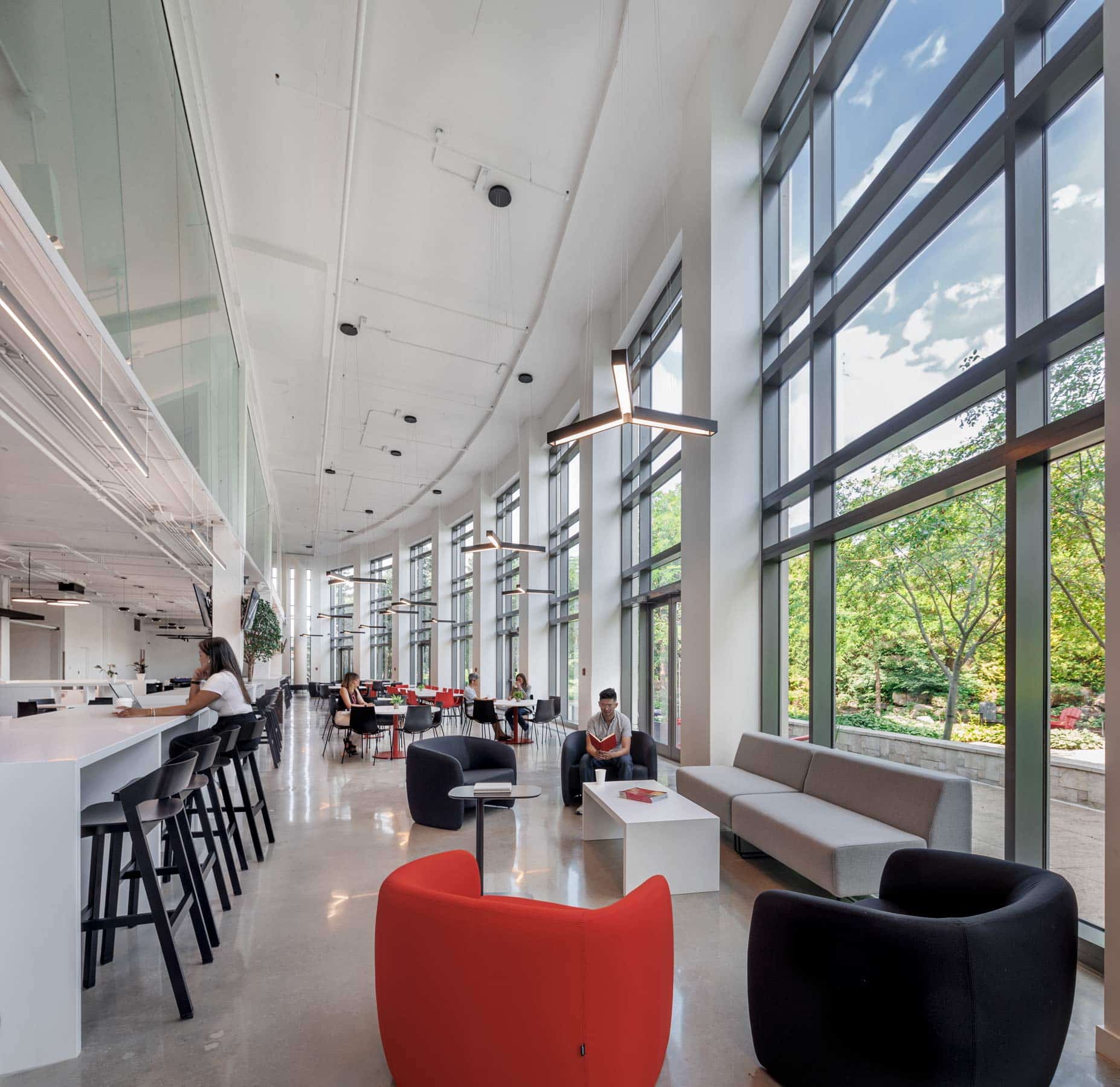
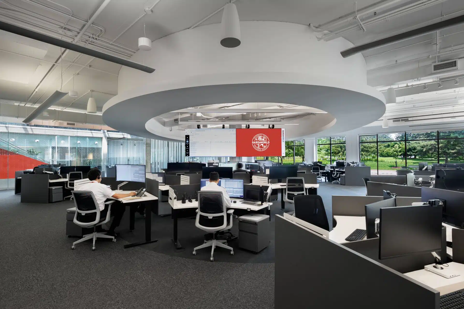
In order to create a work environment of cohesion and interconnectedness, a dynamic layout was used: A 1:4 ratio of closed offices to open work areas, all mediated by a large conference center with multiple boardrooms and state of the art technology for large scale hybrid meetings in private settings. Throughout this 200,000 square foot floor plan, design elements reflect GardaWorld’s core pillars of power, strength, and unity with wall treatments, decals, and interdepartmental transition spaces conveying a sense of purpose and identity. The emblematic lion of GardaWorld’s logo commands attention in fitness and dojo rooms, and mission statements adorn corridors and windows.
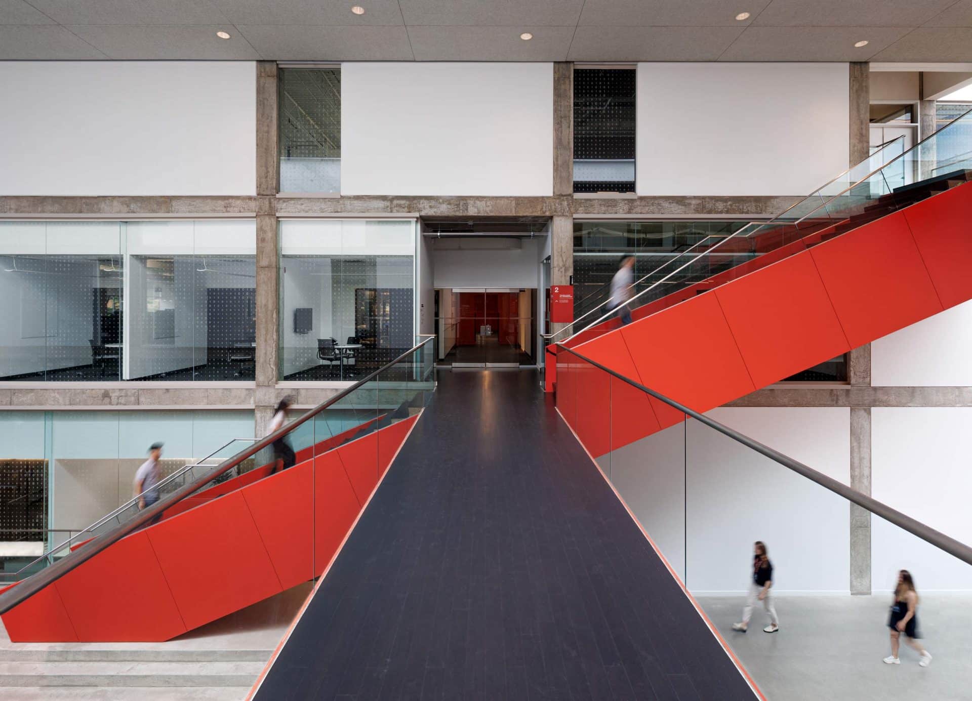
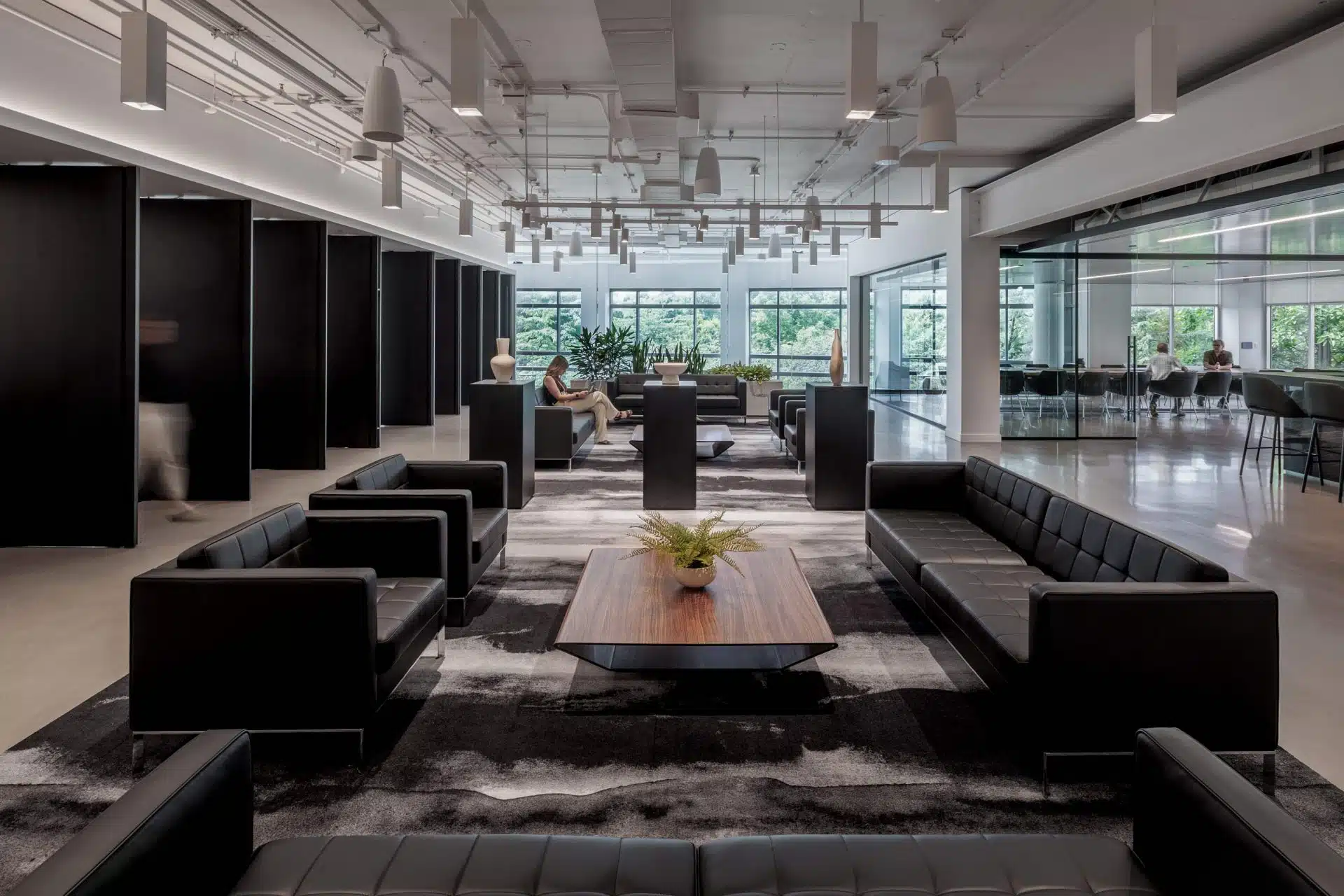
Materiality blends raw architectural elements of concrete, metal, and glass with a bold palette of red, black, and white to distinguish various rooms and visual consistency throughout the office, and glass-walled meeting rooms where privacy is concerned are blacked out. Lines of red and black traverse the departments, forging a bond that serves as nod to the firm’s north star of collaboration, and two prominent red staircases at the entrance serve as powerful wayfinding elements and promoters of movement and well-being to support the project’s pursuit of a Fitwel certification.
Seamlessly connecting departments and teams in a campus-like environment with an interplay of stairs, bridges, corridors, and common areas, the interior design of these headquarters speak to the project’s status as a nexus point for a worldwide organization.


