When every space becomes a destination
Client
PlusgradeLocation
Montreal, QC, CanadaYear
2024-
Discipline(s)
Branding and Graphic Design
When every space becomes a destination
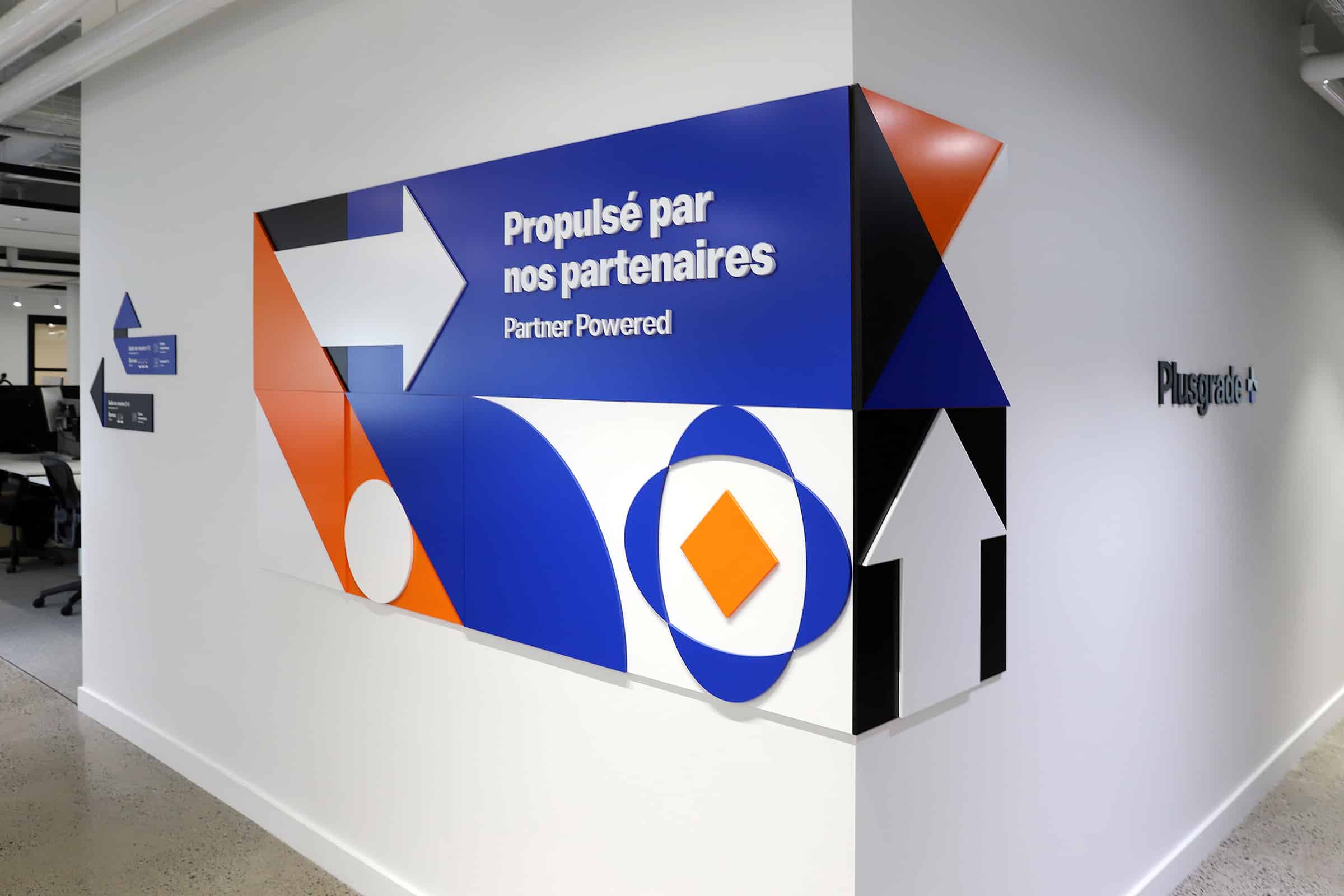
The design of Plusgrade’s headquarters demonstrates how signage adapted to a company’s culture and image can make a difference: Inspired by the shape of Plusgrade’s logo, the idea of folded paper and the art of origami served as the foundation for creating signage perfectly aligned with the mission of this company known for unique travel industry experiences.
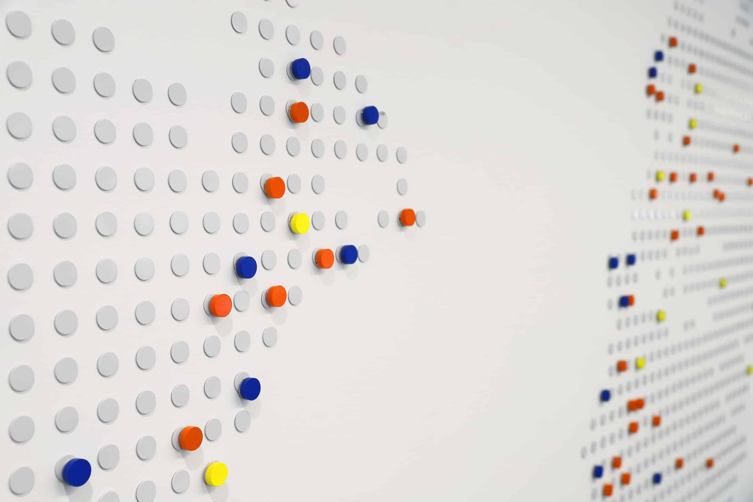
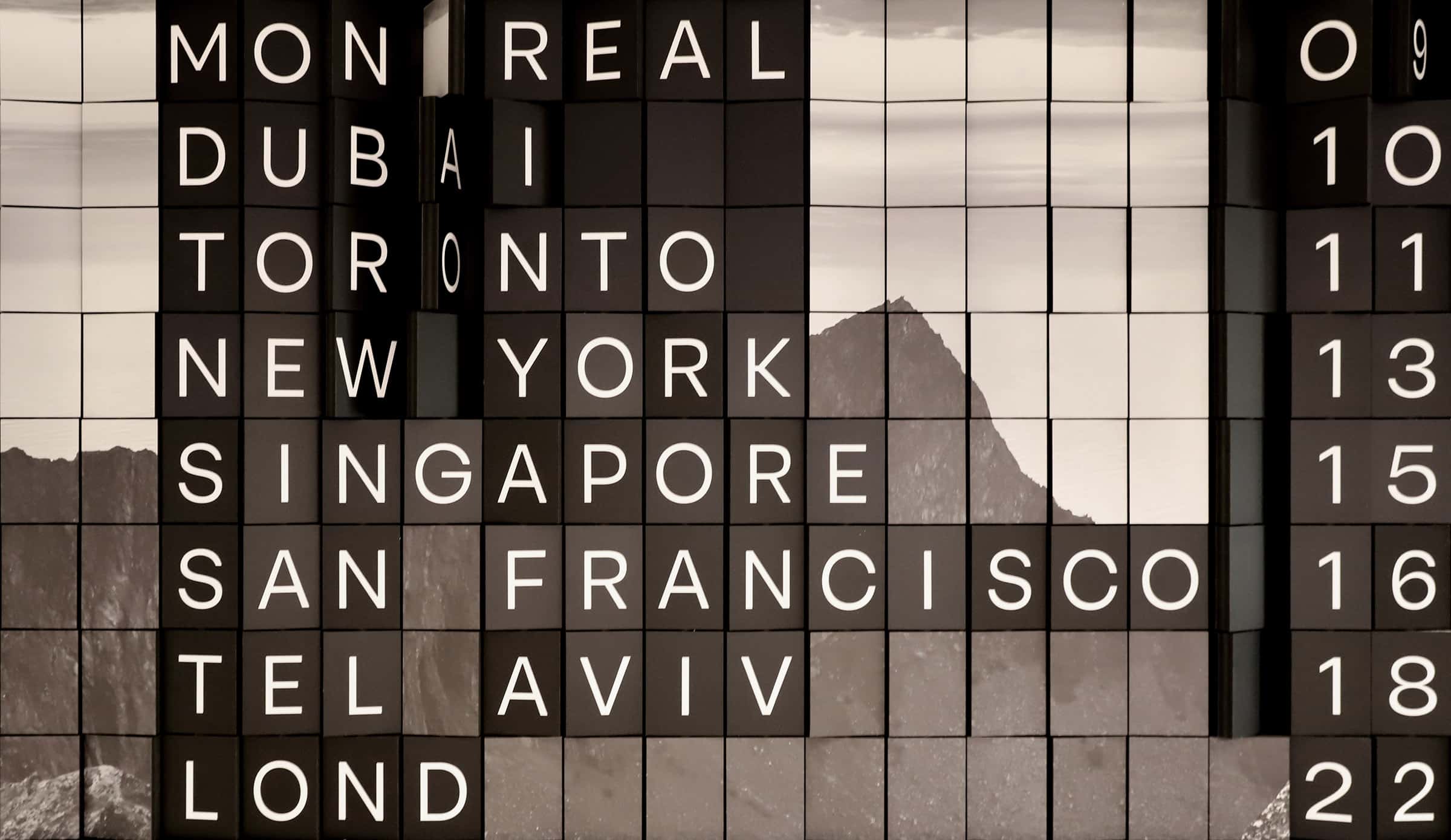
The result is signage that guides, informs, and surprises with its vibrant, energetic qualities and visually appealing contrasts. Each panel plays a role in contributing to a smooth user experience, while offering interactive elements such as a wall reminiscent of the split-flap displays once used in train stations and airports.
Whether it’s an open collaboration space, a closed meeting room, or the reception area doubling as a bistro, each location is a clearly delineated and identified travel destination, using different panels that recall the appearance of folded paper. The use of the two dominant colours of Plusgrade’s blue and orange brand image conveys a sense of energy and enthusiasm while adding a playful touch.
Together, these colours applied to the folded paper concept create a strong and positive image that clearly communicates what the Plusgrade brand represents.